
Form fields can be disabled by simply adding the disabled attribute.
<input type="text" disabled />
<textarea disabled></textarea>
<select disabled></select>
Disabled fields cannot be interacted with by the user; the browser will not allow the field to receive focus or be tabbed to. For an intuitive UI it’s important that disabled fields are clearly evident to the user. Users are easily confused and frustrated when attempting to interact with fields that they are not able to.
To apply custom styling to disabled fields you can add CSS rules that target input:disabled, select:disabled, & textarea:disabled. (Note: IE doesn’t support the disabled pseduo class until IE9, so you’ll need to use input[disabled], select[disabled], & textarea[disabled] attribute selectors if IE < 9 support is important for you. It’ll work just the same.)
While you can provide custom disabled field styling, it’s not generally a good idea. All browsers come with default styling for these fields that attempt to mesh with native UI elements in the OS. Also, users have a certain expectation for what disabled fields look like in their preferred web browser and it’s best not to mess with that.
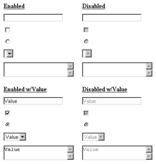
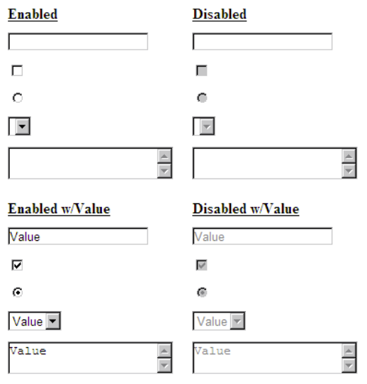
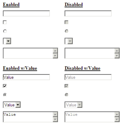
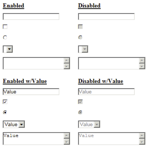
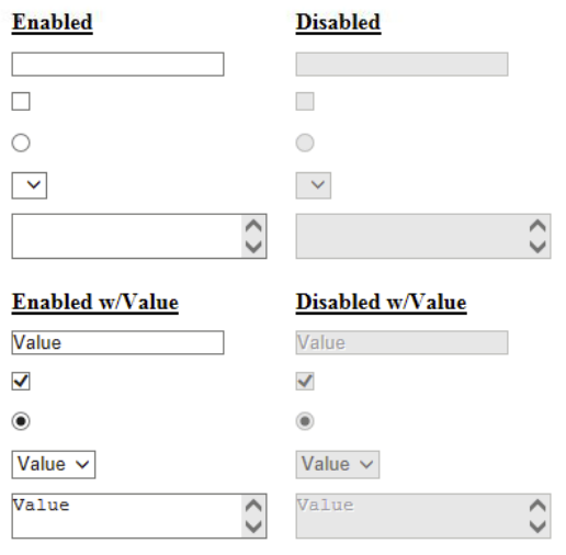
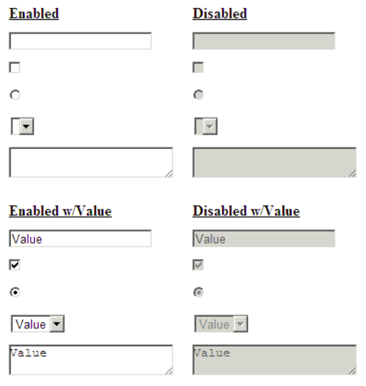
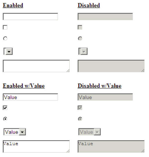
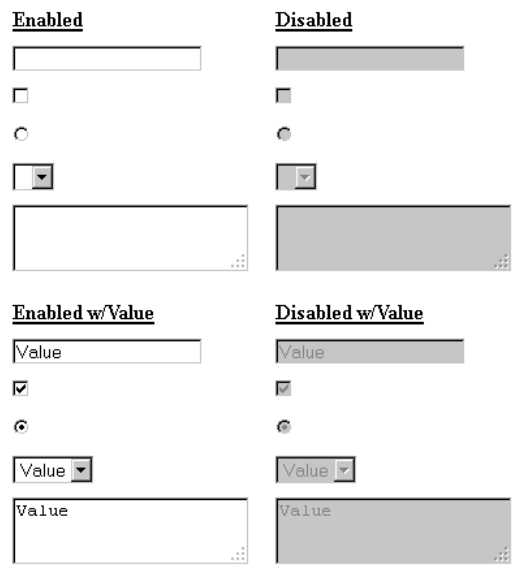
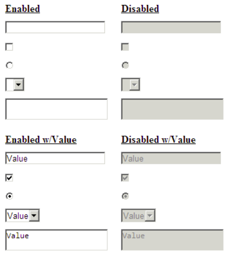
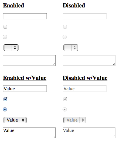
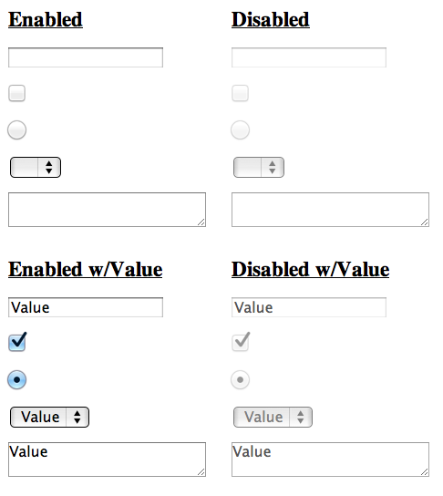
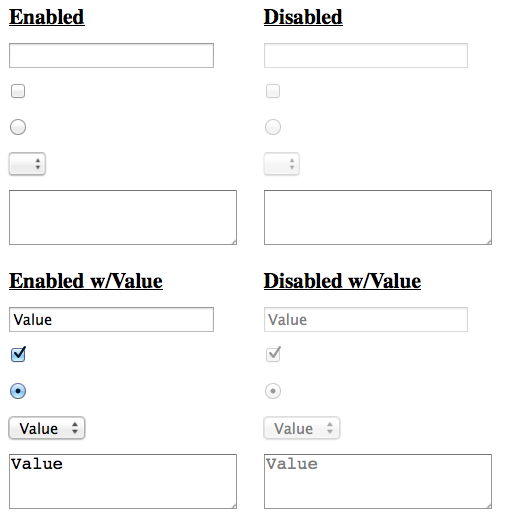
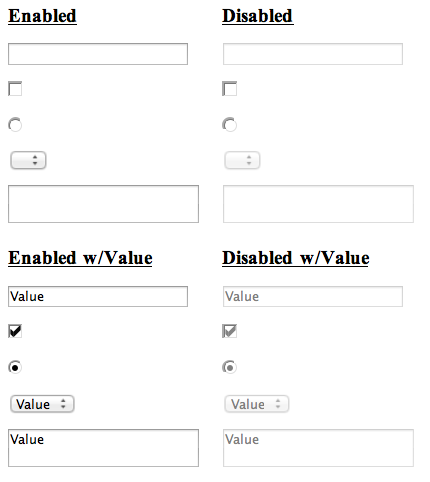
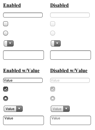
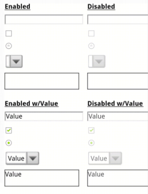
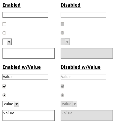
Unfortunately some browser’s default styling is less than ideal. To best show this I’ve created a test case with the most common form elements and recorded a rendering of the test case in a large number of browser / OS combinations. Since some of the styles are more evident when a the element is selected and/or has a value, I included both a grouping with no selected or value attributes, and another with those set.
Markup
Here’s the markup I used for the test cases, some very basic form fields with the disabled attribute.
No Value / Selected Attributes
<table>
    <thead>
        <tr>
            <th>Enabled</th>
            <th>Disabled</th>
        </tr>
    </thead>
    <tbody>
        <tr>
            <td><input type="text" /></td>
            <td><input type="text" disabled /></td>
        </tr>
        <tr>
            <td><input type="checkbox" /></td>
            <td><input type="checkbox" disabled /></td>
        </tr>
        <tr>
            <td><input type="radio" /></td>
            <td><input type="radio" disabled /></td>
        </tr>
        <tr>
            <td><select></select></td>
            <td><select disabled></select></td>
        </tr>
        <tr>
            <td><textarea></textarea></td>
            <td><textarea disabled></textarea></td>
        </tr>
    </tbody>
</table>
With Value / Selected Attributes
<table>
    <thead>
        <tr>
            <th>Enabled w/Value</th>
            <th>Disabled w/Value</th>
        </tr>
    </thead>
    <tbody>
        <tr>
            <td><input type="text" value="Value" /></td>
            <td><input type="text" disabled value="Value"></td>
        <tr>
            <td><input type="checkbox" checked /></td>
            <td><input type="checkbox" disabled checked /></td>
        </tr>
        <tr>
            <td><input type="radio" checked /></td>
            <td><input type="radio" disabled checked /></td>
        </tr>
        <tr>
            <td><select><option selected>Value</option></select></td>
            <td><select disabled><option selected>Value</option></select></td>
        </tr>
        <tr>
            <td><textarea>Value</textarea></td>
            <td><textarea disabled>Value</textarea></td>
        </tr>
    </tbody>
</table>
Results
You can view all the results on one page or see individual ones listed below.
Windows
OS X
Mobile
Findings
In general browsers add some combination of opacity, a grayish background-color, and a grayish color to the element to create the disabled effect. For the most part browsers do a pretty good job making it evident that the fields are disabled.
There are exceptions though. One glaring issue is the display of disabled text inputs and textareas in IE < 10; when no text is present it’s impossible to tell whether the field is disabled. In Windows, all non-IE browsers simply apply a background-color of #EBEBE4 to all disabled elements. Unfortunately, IE < 10 doesn’t do much of anything to designate text inputs and textareas as disabled other than change the color of the text, which, doesn’t work out all that well when there’s no text present.
Normalizing IE
To normalize the display of disabled fields in IE we need to be able to target IE <= 9 with CSS. Why? We don’t want to override the default styling whenever possible. As mentioned earlier browsers apply different styling to attempt to match native UI elements. If you blindly apply a background-color to all disabled elements, you’ll do so in Windows, OS X, Linux, iOS, Android, etc… as well as any future devices where it might look horrible, or worse, confuse the user.
So back to selecting IE <= 9. In my opinion the most elegant way to do this is use IE’s conditional comments to apply classes to the HTML node. This approach was first proposed by Paul Irish in 2008 and is used in the HTML5 boilerplate. There are many variations but in this case we only need to worry about IE <= 9.
<!--[if lte IE 9 ]> <html class="lte9"> <![endif]-->
<!--[if (gt IE 9)|!(IE)]><!--> <html class=""> <!--<![endif]-->
Then we can apply the background-color as such:
.lte9 input[type='text'][disabled], .lte9 textarea[disabled] {
	background-color: #EBEBE4;
}
Alternatively you could use IE’s conditional comments to apply these rules directly:
<!--[if lte IE 9 ]>
	<style>
		input[type='text'][disabled], textarea[disabled] {
			background-color: #EBEBE4;
		}
	</style>
<!--<![endif]-->
Either of these approaches will normalize the display of disabled text inputs and textareas on Windows.
Normalizing IE6
The above solution will not affect the display of these elements in IE6 because it does not support CSS attribute selectors. Therefore, if you’re still supporting IE6 and the display of disabled fields is important to your UI you’ll need some other sort of hook on the node. For example a class will work:
<!--[if IE 6 ]> <html class="ie6"> <![endif]-->
<!--[if (gt IE 6)|!(IE)]><!--> <html class=""> <!--<![endif]-->

/* … */

<input type="text" disabled class="disabled" />
<textarea disabled class="disabled">
</textarea></html>
Then you can apply the following CSS:
.ie6 input.disabled, .ie6 textarea.disabled {
	background-color: #EBEBE4;
}
Other Issues
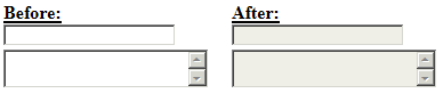
A number of browsers including all OS X browsers except Opera, Android, and iOS do a poor job making textareas appear disabled, in some cases even when text is present. If your UI contains disabled textareas it’s probably worth adding a little bit of opacity to compensate for browsers that don’t make it very apparent that you cannot interact with them.
textarea:disabled {
	opacity: 0.5;
}
The effect is subtle but can make a big difference in helping the user to recognize that the field is disabled, especially if multiple textareas are near each other. Here’s an example from Chrome 17 on OS X:
Summary
Browsers have default styling for disabled fields that is usually pretty good at visually indicating that the field cannot be interacted with. In situations where the browser default isn’t ideal, custom styling can be applied.