
Adding a strikethrough to a line of text in CSS is easy.
<style>
    p { text-decoration: line-through; }
</style>
<p>Hello World</p>
Which displays as follows:
Hello World
But what if you want the strikethrough line to be a different height, color, or whatever?
The Spec
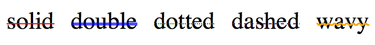
The CSS text-decoration spec defines two new properties for customizing strikethroughs - text-decoration-color and text-decoration-style.
text-decoration-style can have values of solid, double, dotted, dashed, and my favorite - wavy.
Unfortunately these two properties are only implemented in Firefox and are behind a -moz- prefix. Here’s how you can use the various text-decoration-style values in Firefox:
<style>
    p {
        text-decoration: line-through;
    }
    #solid {
        -moz-text-decoration-color: red;
        -moz-text-decoration-style: solid;
    }
    #double {
        -moz-text-decoration-color: blue;
        -moz-text-decoration-style: double;
    }
    #dotted {
        -moz-text-decoration-color: green;
        -moz-text-decoration-style: dotted;
    }
    #dashed {
        -moz-text-decoration-color: purple;
        -moz-text-decoration-style: dashed;
    }
    #wavy {
        -moz-text-decoration-color: orange;
        -moz-text-decoration-style: wavy;
    }
</style>
<p id="solid">solid</p>
<p id="double">double</p>
<p id="dotted">dotted</p>
<p id="dashed">dashed</p>
<p id="wavy">wavy</p>
Which looks like this (note the sweet wavy display):
How to Do it Today… and Better
While the spec changes are certainly interesting, you can accomplish much more today with some basic CSS.
The easiest approach is to draw a line with the ::before or ::after pseudo-elements and position them on top of the element itself. Here, this is implemented with a CSS class name:
.strike {
    position: relative;
    display: inline-block;
}
.strike::before {
    content: '';
    border-bottom: 2px solid red;
    width: 100%;
    position: absolute;
    right: 0;
    top: 50%;
}
This displays as follows:
Hello World
From here you can play with the border-color and border-height properties to achieve the effect you’d like.
The one major caveat to this approach is it does not work on text that spans multiple lines. If you need multi-line strikeouts, you’re stuck with plain old text-decoration.
But as long as your text is on one line, you can use this technique and be as crazy as you’d like. Here’s an example that utilizes ::before and ::after and CSS transforms to create a cross out effect on the text.
.cross {
    position: relative;
    display: inline-block;
}
.cross::before, .cross::after {
    content: '';
    width: 100%;
    position: absolute;
    right: 0;
    top: 50%;
}
.cross::before {
    border-bottom: 2px solid green;
    -webkit-transform: skewY(-10deg);
    transform: skewY(-10deg);
}
.cross::after {
    border-bottom: 2px solid blue;
    -webkit-transform: skewY(10deg);
    transform: skewY(10deg);
}
Which displays as such.
Hello World
So yeah, go crazy.